Current conditions appear to indicate that the long-term bull trend in place since 2011 is accelerating to the upside and increasing its angle of ascent. This is consistent with my long-term analysis that stocks would continue to rise during the Debt Monetarist transitional phase as unlimited value borrowed from the future seeks a return. This is inconsistent, however, with my more recent calls for an intermediate term correction before the bull trend continuation could begin.
Debt Monetarism
The primary Debt Monetarist signaling mechanism is flashing green with the Federal Reserve clearly set to start a rate cutting cycle. Any opinion you may have about the state of “The Economy”, “Profits”, “Balance Sheets”, “Valuations” or any other metric you care to cite is irrelevant in the face of the Debt Monetarist flood that always finds its way into stock pricing mechanisms. Short of a full collapse of an industry business model or full company-specific Enron-like implosion, actual, capitalist market dynamics are barely in force at all anymore, as Debt Monetarism has permeated every pricing and allocation mechanism.
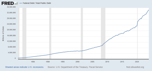
The stark, unvarnished reality is that the entire edifice of “markets” and “economy” floats precariously on an ever-expanding ocean of US Government Debt. Since infinite government borrowing is not rate sensitive, Total Federal Debt continued its meteoric rise post-Covid:
FRED
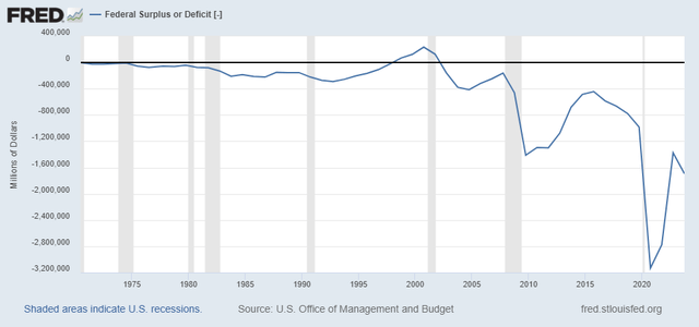
While the Federal Deficit snapped back somewhat, it is not even close to 2019 levels and has begun to grow again:
FRED
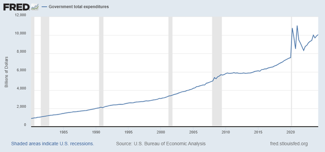
Total Government Expenditures is near post-Covid all-time highs:
FRED
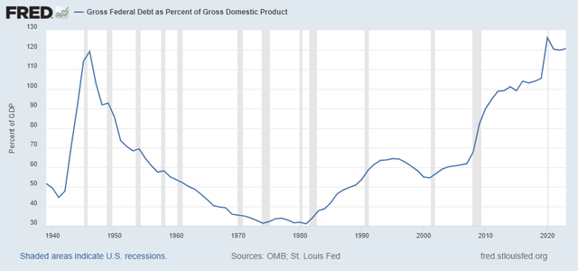
The percent of GDP represented by Federal Debt is higher than during World War II. Note that the decline in this ratio from post-war to 1975 was associated with the greatest period of prosperity. The rise in that ratio has been associated with an ongoing decline of living standards.
At over 120%, we basically would not have an economy without Federal Debt:
FRED
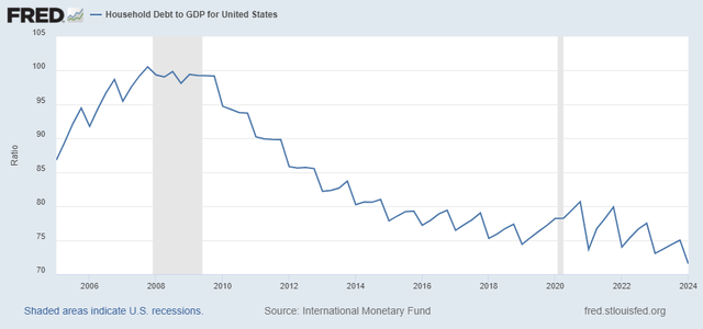
Since the bursting of the Housing Bubble, household debt as a percentage of GDP has cratered as consumers are unable to take on debt to finance consumption:
FRED
Increasingly, government debt and spending is standing in for real economic activity.
When GDP itself is calculated with Government Spending as a major component, what is the statistic actually measuring? It is measuring increasing debt levels, not increasing economic activity. In relationship to stock prices, economic releases such as GDP serve as old-school dog whistles to justify debt-as-asset monetization.
An entirely new economics with new metrics of performance and value is desperately needed.
Chart Analysis
Now, here at the end of August 2024, let’s check in on the monthly and weekly charts.
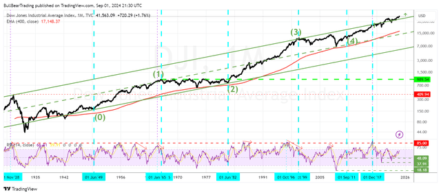
Let’s start with the Very Long-Term Monthly Chart of the DJI:
TheBullBear.com, TradingView
The very long term bull trend began with the end of the 1929-1949 bear market, which took the form of an Elliott Wave triangle formation. The red 400 month exponential moving average was tested at the price lows of the waves (2) and (4) triangle bear markets. The upper return line of that bull trend was created with the 2000 top is now finally being overcome, after an extensive period of travelling above and below it since December 2017.
Monthly RSI has a ways to go before becoming upside extended in the 85 zone. Technically speaking, you can say that RSI has shown a bear divergence pattern with each new high since 2017. And that has often been the harbinger of a substantive correction, particularly when price is at an upper resistance levels near all-time highs.
But in this case, the setup appears to be for a breakout above the rail that goes back to 1929, marking a final Wave (5) panic upside blowout. Under these circumstances, with the Fed set to start a rate cutting cycle, a vertical bull panic, not a corrective bear movement, is more likely.
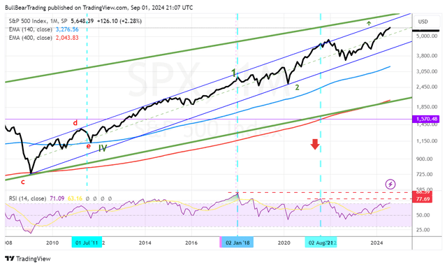
Here’s SPX long term:
TheBullBear.com, TradingView
The bull trend channel from the 2008 low is likely to be taken out as RSI gets back to its 2018 high.
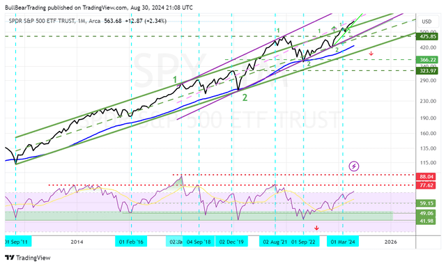
NYSEARCA:SPY monthly shows the most interesting view:
TheBullBear.com, TradingView
On an Elliott Wave basis, the last major bear market, which began in 2000, completed as an Elliott Wave triangle in September 2011. Since the 2020 bottom, there has been a drawn out process of trend acceleration, beginning with an initial breaking of the upper rail in 2021. Now we can see that a new, more acute trend channel has formed (in purple). This comes as price appears to have achieved escape velocity above the old trend.
Another interesting feature of this chart is the wave patterning. Typically, the 3rd wave of a sequence is the most powerful. Right now, the setup appears to be for a 3 of 3 of 3 of 3 of a Major (5). Coming as it does with upside breakouts of major long-term trend channels, a new more acute trend channel, lots of technical upside on monthly charts and the Fed starting a rate cutting cycle, this should be a recipe for upside panic.
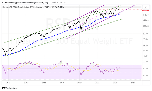
NYSEARCA:RSP is the ETF that tracks the SPX 500 on an equally weighted basis. When it’s lagging, that tends to have bearish implications. For a while, it was, now it has taken the lead with a sharp upside breakout:
TheBullBear.com, TradingView
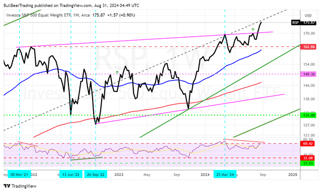
You can also see an accelerating trend channel accompanying the breakout. The action is confirmed by the weekly chart:
TheBullBear.com
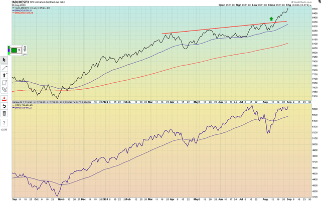
50 Day Advance-Decline Line confirms the sharp improvement in breadth:
TheBullBear.com, Stockcharts.com
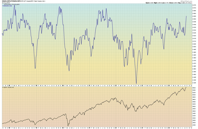
50 day SPX Up Volume/Down Volume ratio has also broken out sharply.
TheBullBear.com, Stockcharts.com
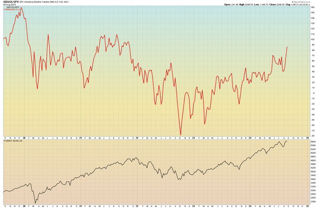
Confirming the volume breadth explosion, 200 day SPX Up Volume:
TheBullBear.com, Stockcharts.com
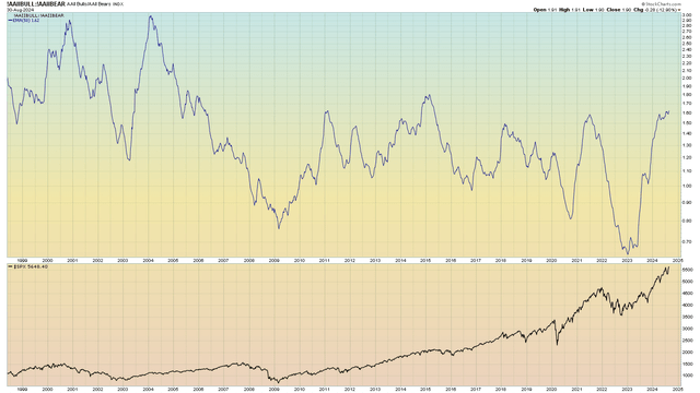
While the Bull/Bear sentiment ratio is at the upper end of its post-2008 range, it’s not near the top of its historic range, so there may be room to run before all participants are “all in”.
Stockcharts.com
The Long-Term View
While I’ve been calling out Debt Monetarism since I began writing The BullBear Market Report in 2009, my perspective is somewhat different from the typical anti-Keynesian, pro-Austrian. While there are nefarious human forces at work, even those forces are moved and shaped by more fundamental, historical drivers. In physical terms, the most fundamental has always been technology.
It is technology which has enabled and shaped the nature and scope of the human capacity to transform environmental factors into value and distribute that value. From the first stone hand tools to the wheel, the printing press, the steam engine and the computer, technology has enabled and organized the power to generate and distribute economic value.
For many years, I have been saying that we are on the cusp of a technological revolution that will multiply this power many-fold. Debt Monetarism, for all the ugly and harmful distortions it has engendered, showed up on the stage of history to bootstrap the technological productivity explosion that begins now. Without massively borrowing value from the future, the investment necessary to produce Artificial Intelligence and all of the other associated technologies may not have been possible, or may have taken much, much longer to develop.
With regards to stock prices, this means that in this final 5th wave of the long-term trend, a blow off vertical is very likely. While I had thought that a more extensive (in time) correction was necessary to set that up, it appears, based on the data I have shown in this report, that that is not the case, and the next leg of the technology bull is starting to stampede higher.
Going forward, identifying those sectors and companies that will be stressed by the coming transformations and those that will be at the forefront of them will be the key to sound analysis. I’ll be orienting towards combining my keen interest and understanding of technology with my economics background and analytical skills to uncover the best sectors and companies to invest in and those which need to be avoided and exited.
Read the full article here


